
Above and Beyond the Fold
The term “above the fold” originated with newspapers and refers to the top-half of the front page that is “above the fold” of the paper. It’s the portion of the paper that editors pay the most attention to because it sells the paper – the section with the BIG story and emotionally charged image that grabs our attention. In web design, “above the fold” refers to the portion of the web page that a visitor can see when they first arrive on a website without needing to scroll. We’ve known for some time now that user interest exists beyond the kingdom of the fold, and that users will scroll to get additional information. As a matter of fact, scrolling comes so naturally most users don’t even realize when they are doing it.Let the Good Times Scroll
We scroll all day long on our touchscreens, happily spinning our mouse wheels at ease and eagerly let our fingertips do the browsing on our laptop mouse pads. We don’t even think about it. This is because it’s easier and less time consuming to scroll then to go somewhere else, click, and wait for a page to load. In April 2011, Apple even removed the scrollbar from Mac OS X.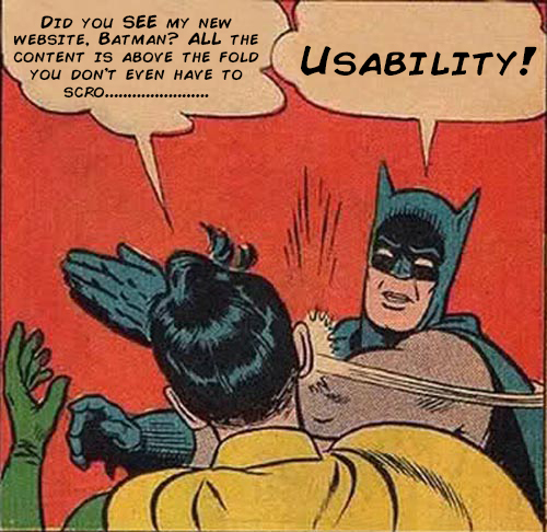
- Scrolling is a continuation (faster), clicking forces the user to make a decision (slower)
- No waiting for pages to load, users just scroll to the next section to keep the reading flow intact
- Fewer, longer pages are a better approach for users
- Scrolling is more touch screen friendly (we do a whole lot of scrolling on our devices these days)
- 66% of attention on a normal media page is spent below the fold ( more statistics on scrolling and usability here)
- Most popular websites embrace the scroll (think Amazon, Facebook and Google)
Some Elements That SHOULD Stay Above the Fold
Scrolling and clicking aside, there are some strategic website elements that should have an existence above the fold. When visitors come to your website they shouldn’t have to search for a phone number or navigation. Make it intuitive and wonderful things will happen. These are key website elements that should be “above the fold”:- Contact Information
- Logo and Company Name
- Navigation
- Search Bars
- Promotions
Striking a Healthy Balance
There are trade-offs between clicking and scrolling. Scrolling is better for usability, however clicking is better for analytics and search engines. Don’t force yourself to follow web design rules that are no longer relevant. Know what’s important to your target market and use a combination of both to create a healthy, well balanced user experience. Knowing the pros and cons of scrolling and clicking will help you decide the best direction for your website. To learn more about scrolling benefits and effects, check out Parallax Scrolling in Modern Web DesignWant to learn more about the web design process? Contact our Raleigh Web Design Experts at TheeDigital in Raleigh, NC at 919-341-8901 or schedule a consultation.
Tags: Web Design
Gabrielle Tardive
Gabrielle Brooks is a Digital Strategist at TheeDigital, a web design and SEO agency based in Raleigh, NC. Give Gabrielle a call at 919-341-8901 to talk about web design that will meet your needs.


