The Quick Answer
“Above the fold” is the part of a webpage a visitor sees before scrolling. It still matters because it is the first thing a visitor judges, the area search engines weigh most heavily for page experience, and the section AI search tools pull from most often when summarizing a page. The exact cutoff point changes by device and screen size, so the fix is not a fixed pixel number. It is a content hierarchy: a clear headline, a real answer or value proposition, and an obvious next step, all visible without scrolling on the devices your visitors actually use.
Where the Term Comes From

The phrase comes from newspapers, where editors placed the strongest headline and photo on the top half of the front page, above the literal fold in the paper, so it would catch a reader’s eye at the newsstand. Web design borrowed the term for the same reason: the content a visitor sees first still does the most work to keep them on the page.
The difference online is that the fold is not fixed. It moves with screen size, device, browser chrome, and resolution. A phone in portrait mode, a laptop, and an ultrawide monitor all cut off content at different points. That variability is exactly why treating the fold as a strategy rather than a single pixel line still pays off.
Why the Fold Still Matters
Visitors form an opinion about a page within seconds, and most of that judgment happens in the space they can see without scrolling. Nielsen Norman Group’s eye-tracking research on scrolling behavior found that users spend the majority of their page-viewing time looking at content above the fold, with attention dropping off sharply once they scroll past it (Nielsen Norman Group). That first screen sets expectations for everything that follows.
A few concrete effects of getting it right or wrong:
Load speed tolerance. Even a one-second delay in how fast that first screen becomes usable measurably reduces conversions, so above-the-fold content needs to load fast, not just look good.
Bounce rate. A cluttered, slow, or unclear first screen gives visitors no reason to stay, so they leave without exploring the rest of the site.
Conversion rate. A clear call to action in view early gives visitors an obvious next step instead of making them hunt for one.
Perceived credibility. Visitors judge legitimacy and professionalism from the first screen before they read a word of body copy.
SEO and the Fold
Above-the-fold content affects not only the visual user experience, but what search engines see.
Traditional SEO:
Search engines evaluate page experience signals, including how much of the first screen is genuine content versus ads or interstitials, and how quickly that content becomes usable. Core Web Vitals metrics such as Largest Contentful Paint measure exactly this: how fast the largest visible element above the fold renders. Pages that bury real content under ads, pop-ups, or slow-loading elements tend to underperform in rankings.
Mobile-first indexing:
Search engines primarily evaluate the mobile version of a page for ranking purposes, and mobile devices generate the majority of web traffic in most markets. That makes the mobile fold, not the desktop fold, the one that matters most for search visibility. A first screen that looks great on a widescreen monitor but buries the headline and CTA below a bulky mobile menu is optimizing for the wrong device.
GEO and AI search:
Optimizing page content for GEO and AI search is important, but it is not specifically an above-the-fold consideration. Clear, well-structured content that directly answers users’ questions can help AI search tools understand and reference a page, regardless of where that content appears. When designing above the fold, focus primarily on the visitor experience, while applying GEO best practices throughout the entire page.
Common Myths About the Fold
"The fold doesn't matter – everyone scrolls now."
People do scroll more than they used to, but scrolling depends on the first screen giving them a reason to. Attention is still concentrated above the fold even when the total page is long. The fold is not a hard stop, it is a starting point that determines whether a visitor bothers to continue.
"The fold is the same for every industry."
It is not. An e-commerce page needs featured products and a clear path to purchase above the fold. A law firm page needs a credibility signal and a way to make contact. The principle stays the same across industries: put the thing your specific visitor came for where they can see it immediately.
"Above the fold means never designing for scroll."
A well-placed visual cue, like a partial view of the next section, can encourage visitors to keep scrolling once the first screen has earned their trust. The goal above the fold is to start the journey, not to cram the entire page into one screen.
How to Design for Your Fold: A Practical Process
Start with your audience and purpose. Before placing a single element, know what the visitor is trying to accomplish and what the page needs to accomplish for the business. Everything above the fold should serve one of those two goals.
Wireframe for multiple screen sizes. Sketch the placement of logo, navigation, headline, CTA, and any hero image or video before worrying about visual design. Build separate wireframes for mobile, tablet, and desktop, since the fold sits in a different place on each.
Common breakpoints worth testing against:
- Mobile: 360×640, 375×667, 414×896, 390×844
- Tablet: 768×1024, 810×1080, 962×601
- Desktop and laptop: 1366×768, 1440×900, 1920×1080, 2560×1440
Use scroll heat maps to find your real fold. Analytics tools that track how far visitors scroll show exactly where attention drops off for your actual audience on your actual site, which is often not where you would guess. Once that data is in, compare it against what currently sits above that line and adjust accordingly.
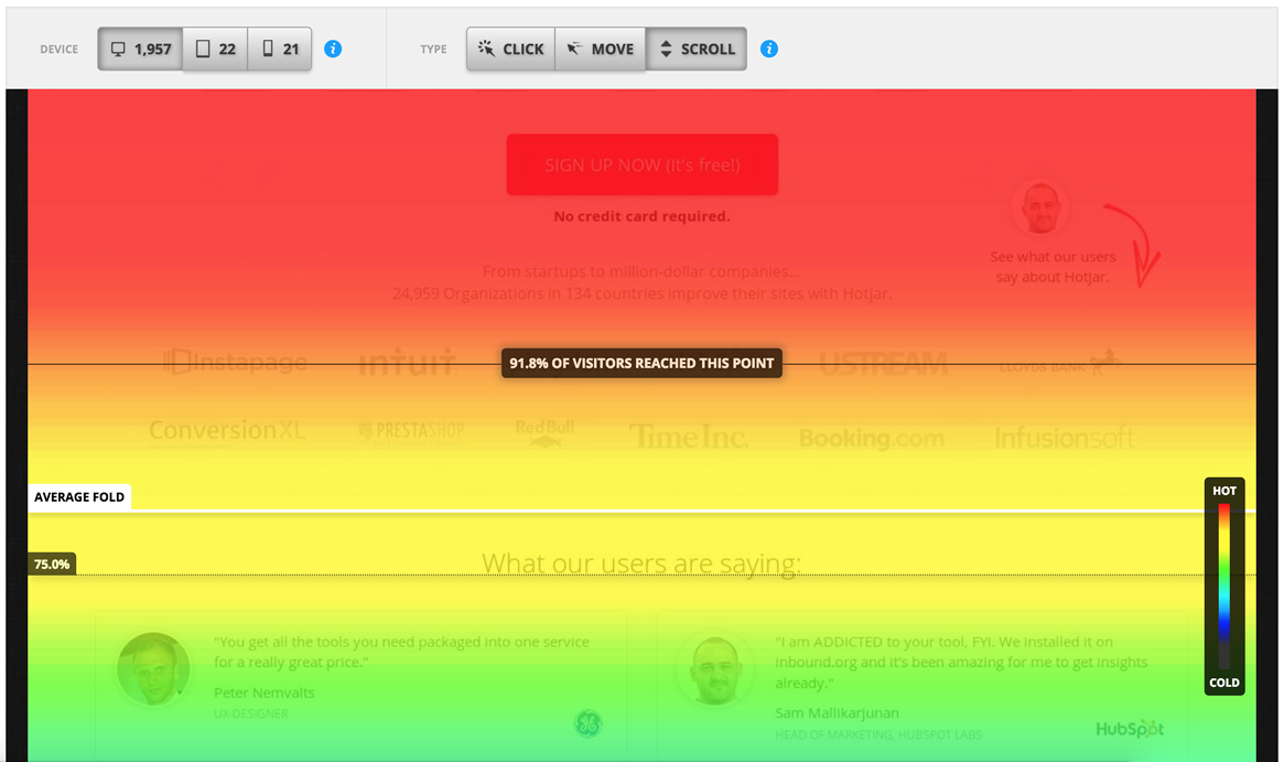
At TheeDigital, we utilize current website data to see what are the most common breakpoints a client’s website is being viewed at, and from there ensure we are accommodating that in a redesign. For new websites, we utilize industry standards and our own experiences to different screen breakpoints.
Test with real users before and after launch. Prototype the layout, watch how people interact with it, and note what they notice first, what they ignore, and where they hesitate. Use that feedback to refine the design rather than relying on assumptions.
Keep refining with analytics after launch. Bounce rate, time on page, and conversion rate by landing page all tell you whether the above-the-fold experience is working. Treat the first screen as something to monitor and improve continuously, not a decision you make once and leave alone.
Frequently Asked Questions
Not specifically because it’s above the fold. AI search systems benefit from pages that provide clear, direct answers and well-structured information. Putting a concise explanation near the beginning of a page can make the content easier to understand, but there’s no established GEO advantage to keeping that information within a particular screen height.
There is no single number. It changes based on device, screen resolution, and browser interface, which is why designers plan by content hierarchy and test across common breakpoints rather than targeting one fixed height.
Ads placed above the fold can generate revenue, but overloading that space with ads at the expense of real content can hurt both user experience and search rankings. If ads appear there, they should be secondary to a clear headline and CTA.
Scroll heat maps and analytics tools that track scroll depth show where your specific visitors stop looking on your specific pages, which is more reliable than guessing based on a standard screen size.
What Actually Matters More than the Fold
The fold is useful for thinking about what visitors see first, but it should not dictate the entire design of a page. A strong website focuses on the overall experience rather than trying to squeeze everything important into the first screen.
Clear messaging. Visitors should quickly understand what the page is about and why it matters to them. A clear headline and supporting copy are more valuable than filling the first screen with too much information just to keep it above the fold.
Content hierarchy. The most important information should be easy to find, whether it appears before or after a visitor scrolls. Headings, spacing, visuals, and calls to action should guide people naturally through the page.
Page speed and usability. A fast, responsive page that works well across devices is more important than hitting a specific fold height. Visitors should be able to read the content, navigate the page, and take action without unnecessary friction.
Search-friendly content. SEO and GEO should be considered across the entire page, not just above the fold. Useful, well-organized content that answers real questions gives both traditional search engines and AI search tools more context to understand the page.
A reason to keep scrolling. Not everything needs to appear on the first screen. The job of above-the-fold content is to give visitors confidence that they are in the right place and a reason to continue. From there, the rest of the page should deliver on that expectation.
Instead of asking, “Can we get this above the fold?” a better question is, “Is it easy for visitors to understand what they should do next?” The fold is one part of that experience, but clarity, usability, performance, and useful content matter more. We work through this issue often with our clients: what is the most important action a user should take on your website? What are the keywords we want to work with for SEO? And then how do we marry it altogether?
Most problems can be prevented by using a web design company that is also experienced in digital marketing. We can be that team for you! TheeDigital is an experienced web design agency that is here to help. Contact our award-winning web designers at 919-341-8901 or schedule a complimentary consultation and website review
Tags: Web Design

Melissa Read
Melissa is Lead Project Manager at TheeDigital with over 25 years of eCommerce, web design and project management skills, along with design, development and copywriting. See all posts written by Melissa.