
What Is a Contact Page?
Your contact page is a crucial way of connecting you to future and existing customers. When it comes to your contact page, the design, form, and UX may need as much thought as your site’s homepage. That might sound crazy considering how much information is on the homepage, but let me explain: The message you send on this page needs to be clear and easy to use.A well-designed contact page should include:
- Contact form
- Phone number (and fax number)
- A Google Map embed with your location
- Online chat, especially for ecommerce stores and SaaS websites

Here are 5 of our favorite effective and creative contact pages:
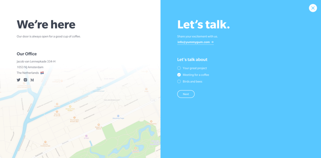
1. Yummygum.com
Important notes to take away:
1. Showcase your personality – Yummygum’s personality and light-hearted nature comes through in their contact form. By using ‘let’s talk’ instead of ‘fill out our form’, you already feel at ease communicating with them. 2. Guide users down the path – Yummygum narrows down why someone would need to contact them using a funny list of choices. This tactic can be used on any website, including a dental practice website, legal practice site, or local retail store. When creating your choices, think of WHY someone is contacting you. Give them the options first with a simple multiple choice list so they are less likely to feel overwhelmed filling out fields while still giving you and your team the information you need.2. Coca-Cola.com
Important notes to take away:
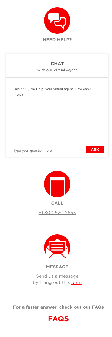
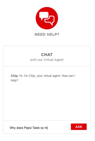
1. Mobile-friendly experience – Coca Cola considered the mobile experience when creating their contact page. Now, anyone who visits their contact page will see/experience the same thing, just maybe in a different layout or format. 2. Multiple contact methods – The chat feature may not work for you, but including a form, a phone number, an email, or another contact method can increase the chances of someone getting in touch with you. Options are good! 3. Use FAQs – Give the customer a link to your FAQs (you do have a FAQ page, right?). They may find what they’re looking for faster if it has been answered (and if you put it in that FAQ page that I know you have). 4. Creating a user experience – Now, I must admit that I would take Pepsi over Coke (unless it’s Cherry Coke of course), but when we’re talking about creating EFFECTIVE contact pages, Coke wins over Pepsi. Hands down. The debate is over! Pepsi introduced all their brands on their contact page resulting in an overwhelming experience. Even after you selected the product you want to discuss, they immediately force you to “search” for your answer by TYPING a question! Coca Cola, you have a great user experience +2 points to you!3. erminandoaliaj.com
Less is more. You’ve heard the phrase before so now we’ll see what that looks like on your contact page!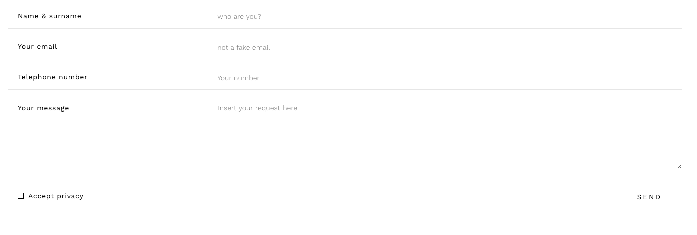
Important notes to take away:
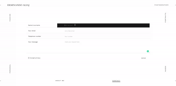
1. Simple, clean forms – Simple and clean forms VERY clearly lets the user know where they are on the form and what to do. 2. “Less is more” – Keep your site menu clean. I would not recommend your menu wrap around your content for most companies. This site belongs to a photographer and this is their take on a contact page and that is ok.4. BrandAffair.ro
Important notes to take away:
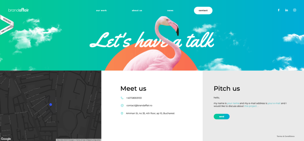
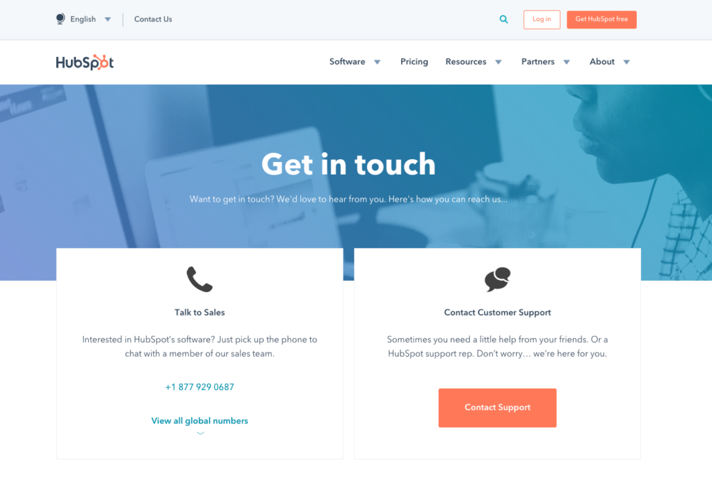
1. Use color – Color can help break up sections on a page and draw attention to what is most important. 2. Layout – A consistent layout of text will create a natural flow for the eye and guide users directly where you want them to be.5. HubSpot.com
Important notes to take away:
1. Think about the customer journey. Make the customer’s journey easier by guiding them down the right path from the very start.Before We Go!
Always Consider Mobile
Many of your customers could be using the mobile version of your site so make sure that the mobile experience is top-notch! Consider using Modal Forms as they can utilize the screen space when they are needed without taking up prime real estate when they aren’t needed.

Remember Your Manners
Keep the user on your site with a simple “Thank You” message that CLEARLY conveys the message was sent successfully can make all the difference. Test your form to make sure the thank you message displays and makes sense.
Don’t Ignore Your Contact Pages
Something happened (could be good or bad) to your customer in order for them to get to your contact page. It could be that they love what they see and want more information or that they’re upset and coming to you for help. In most cases, your contact form should only ask for the essential information: Name, Email, Message. Sure you can ask for a phone number, but not everyone is willing to share that information until they trust you and your company. So, use these examples to build the best, most effective and creative contact pages that match your brand while making it easy and clear for users to contact you! Good luck!Need a UX Design Agency?
Let us create a visually interesting contact page for your website! Contact the web designers at TheeDigital in Raleigh, NC at 919-341-8901 or schedule a consultation.
Tags: Web Design
Richard Horvath
Richard Horvath is the founder of TheeDigital, a Raleigh based award-winning web design and digital marketing agency. He is proud of his team and the results that they provide to their clients.