
Responsive Web Design Services
All of our websites are meticulously designed to look great on any device, any browser and on any size screen.


Serving All Visitors Regardless of Their Device and Screen Size!

Our responsive web development process starts with mobile-first in mind. Instead of creating multiple websites to display on different devices, responsive website design services make it possible for your website to scale, move, and rearrange into multiple layout variations.
The result is a beautiful website that your visitors can enjoy no matter how they’re browsing while you get the benefit of not having to compromise the look of your website readability or your branding.
Some of Our Happy Responsive Web Design Clients

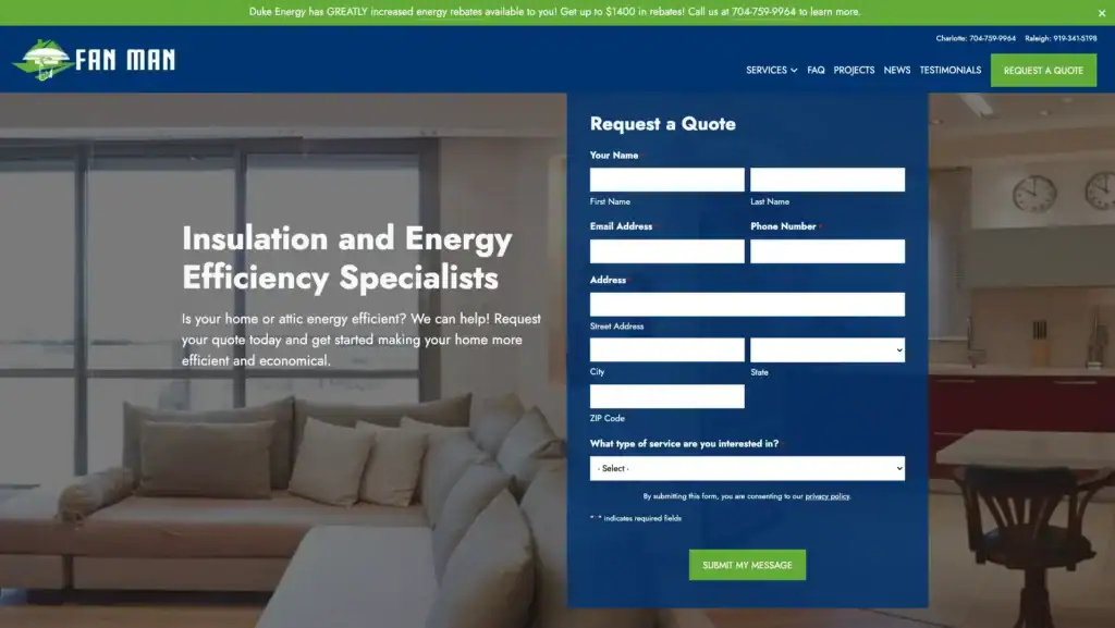
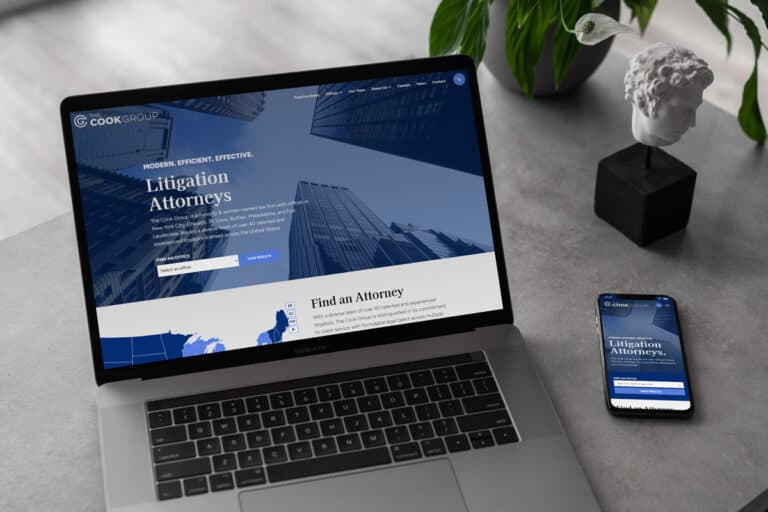
SEO and PPC for a Raleigh Home Services Company
See how Fan Man increased visibility and engagement with targeted SEO, PPC, and a modern website redesign from TheeDigital—driving a 27% boost in organic users and a 36% higher engagement rate.
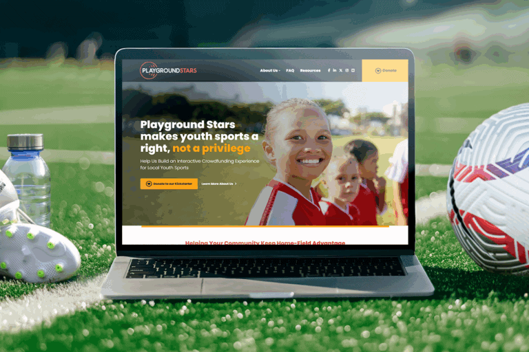
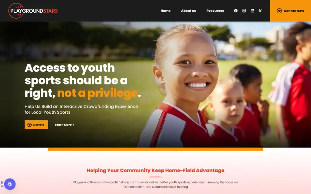
WordPress Website Development for a Local Raleigh Non-Profit
Riggs-Harrod Builders partnered with TheeDigital to modernize their outdated website and strengthen their competitive edge in the commercial construction industry. The new site highlights their portfolio, communicates their values, and positions them as a trusted leader through a bold, professional digital presence.
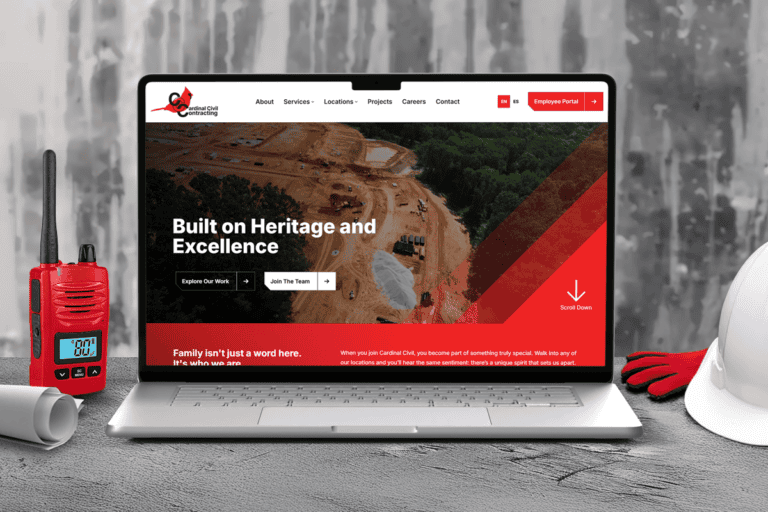
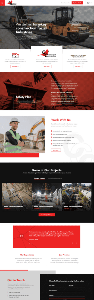
Custom WordPress Development for a Construction Industry Leader
Discover how TheeDigital created an easy-to-update WordPress website for this North Carolina construction industry leader, enhancing recruitment and company culture.

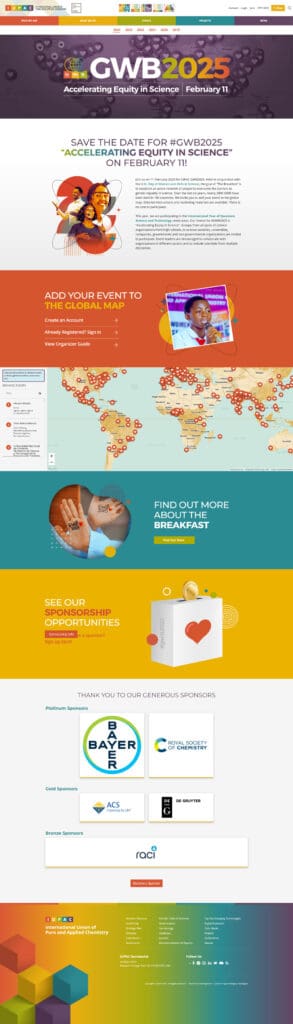
IUPAC Global Women's Breakfast
Discover how TheeDigital’s custom event registration system and creative design solutions help IUPAC connect Global Women’s Breakfast events worldwide.
Benefits of Responsive Web Design
Happy Visitors
Responsive websites give visitors an optimal browsing experience, anytime, anywhere, and on any of their favorite devices
One Dynamic Website
A responsive web design company offers easy to update the website and see your content populate across all device types – saving you time and money
SEO Friendly
Improves visibility in the search engines, and is clearly indicated “mobile-friendly” by Google in search results
Increases ROI
Engages visitors and improves user experience with mobile device-friendly layouts, increasing your traffic, conversions, and revenue
Our Responsive Web Design & Development Services
Today’s consumer is accessing information, shopping, and browsing on mobile devices far more than their laptop or desktop computer. At TheeDigital, we understand the importance of mobile design for business owners so you can appeal to your customers in a way that works best for them. Using a ‘Mobile-First’ approach, we are able to design and develop user-friendly responsive websites that engage, attract and convert.
Our responsive website design and responsive web development services include:
- WordPress Mobile Design
- Magento Mobile Design
- WooCommerce Mobile Design
- Search Engine Optimization
- Cross Device Testing
- Cross Browser Testing
Why is TheeDigital the Best Choice for Your Web Design Project?
We are very proud to be an award-winning agency with headquarters in Raleigh, NC. Our designers and developers have so many years of experience creating a beautiful responsive website, great user experience and a money-generating machine. On top of that, our digital marketing experts will take the website to the next level by utilizing the best practice of SEO and PPC techniques.
- Transparent Approach
- Results Oriented
- Customer Centric
- Award Winning
Our Clients Love Working With Us
Thanks to TheeDigital’s search engine marketing efforts we have been able to sustain high rankings on Google and provide better user experience.

Thank you to the whole team! The entire process went so smooth. Definitely way easier than any other website launch I’ve done in my career. And we genuinely appreciate your partnership and how much TheeDigital has stepped up to understand our organization and our business.

Finally, a dream of many generations of the IUPAC community has materialized. First “aesthetical” impression – BEAUTIFUL.

Everything looks fantastic, I cannot express how pleased we are with both sites (Strategic Systems and CEI). You all have done a fantastic job!

Our new website is much more interactive and completely mobile friendly. Immediately, we saw an increase in traffic to our website as well as an increase in people contacting us from the website. We’re ranking on search engines for our main keywords – some on the top page! The TheeDigital team truly listens to our requests and offers impactful marketing advice. We are very pleased with the traffic to our website and TheeDigital’s marketing efforts!

I have enjoyed working with TheeDigital on multiple websites, everyone has been always professional and easy to work with.

TheeDigital designed our website for which they won an award. They have been great at getting content to our website that is timely, relevant and driving traffic to our site. All the staff have been a pleasure to work with, to offer helpful suggestions and to keep us informed.


Why Clients Love Working With Us


FAQ About Responsive Design
Instead of building individual websites for each screen and device such as mobile, desktops, tablets, etc., you can develop one responsive website that fits all screens. Furthermore, responsive design enables the business owner to manage all initiatives through a single administrative interface instead of managing each website individually for analytics and content updates. It helps you save on cost and time.
There are different ways to see if your website is responsive or not. The easiest way would be to resize the browser window. If the website functionality does not change when you resize the browser window, your website is not responsive. Another way is to access your website on desktop, right-click on the main screen, and then click “inspect”, once the window opens up, view the upper menu and click on the tab beside “Elements” that show different screen sizes. Alternatively, there are many other online tools that you can use to test the responsiveness of your website.
Google Search Engine prefers responsive websites over static
Improves the usability of the visitor(User friendly)
Reduces the bounce rate of the visitors
Avoids duplicate content
It all depends on how your old website is developed. In some cases, you will need to build a brand new website. But the good news is that since you already have the content and pictures, a responsive website will be much faster to develop. To provide you with an accurate range, please call us at 919-341-8901, and one of our responsive website design company experts will be more than happy to help out.
Give Your Visitors an Optimal Viewing Experience
Request a responsive web design services quote today to see how our web design team can improve your website’s mobile user experience. Call 919-341-8901 or send us a message below to get started.