
High traffic on your website doesn’t always equal a high conversion rate. You could invest time and money in quality SEO, backlinks, creative content, and a mobile-friendly design, but still, come up short when it comes to converting leads.
Your website is seeing plenty of traffic, but your phone is not ringing. Why is this happening? There are several reasons why your visitors leave a website before converting.
1. Your Call-to-Action is Hidden
People’s attention spans online are very short, because we have everything at our fingertips. If a potential customer doesn’t see what they’re looking for right away they will look elsewhere. Studies have shown that when people do research online, they don’t actually read the content, they scan it. This means that all of the lovely content you’ve spent so much time on is probably going to be glossed over.
“Readers” often only look at headings and bullet points, so if your content is well organized with these they may stick around. However, if your call-to-action isn’t clear and visible, your visitors are just going to leave your website without contacting you. So, in order to ensure that you’re getting in contact with your visitors, it’s imperative that your CTA is as obvious as possible.
To do this, think about your customer’s journey when designing each page on your website. What do you want your customer to do? What do they need and how can you entice them without selling them too hard?
Having too many CTAs is just as bad, if not worse, than not having one at all or having one that is hard to see. Putting contact forms and pop-up CTAs all over the page aggravates visitors and lowers your chance at converting leads even more. This is especially true if they have to fill these forms out before they can view your content. The trick is to find the line between making your conversion points clear and accessible without annoying your visitors with sign-up walls.
Here are some tips for making your call-to-action visible and engaging:
- Create a simple animation that guides the visitor’s eye.
Catch their eye immediately with an animation. Modern web designers often create simple micro-animations or engaging visuals that grab the visitor’s attention, then direct that attention smack dab to the call-to-action (CTA).
The animation leads the customer through a fun and engaging experience from the beginning to the point of converting. It’s easy to understand and simple to navigate.
- Put your phone number in the header (and make sure your visitors can call just by clicking it).
Mobile browsing has eclipsed traditional browsing from a desktop or laptop computer. So, it’s important to ensure that your mobile visitors can contact you easily right there while they’re on their phones. Having a mobile phone link in your header will ensure that they can easily contact you while browsing your site. Use a sticky header on your site to ensure that your CTA and content are easy to access and digest. It scrolls with the page so that the user never has to scroll all the way to the top to call you or navigate to a different page. - Add a CTA button front-and-center on the hero image
Wondering where to put a link to your contact form? Adding a button or a link in your hero image puts it front and center of your visitor when they first load the page. That way they know that they can easily contact you (and how to) without forcing the form down their throat as they navigate through your page. Anything that makes your CTA easier for your leads to find and click will make converting them easier as well.
2. Your Headline is Confusing
When a potential customer first lands your page it should reassure them that they’ve found what they were searching for. Try viewing your front page or landing pages as if you are a new visitor. Anticipating your customer’s first questions and having the answers waiting for them when the site loads will help with this.
Your headline is likely the first thing that your visitors will see when your site loads. Don’t confuse your customers with a vague headline. It should explain exactly what your company does or what you’re trying to tell them about. Creative language can be nice and may speak to your brand voice, but if you’re too vague, you may lose visitors and business. Your headline should quickly communicate to visitors exactly what it is that your business does so you cna continue converting leads.
Try to anticipate your customer’s first question upon entering your site. What kinds of information might they need to know immediately?
- Services
- Location
- Why your company is the best
- Ease of service
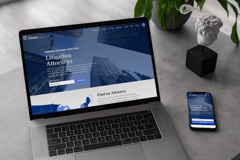
Let’s look at this example, “Sninski & Schmitt Family Dentistry”.
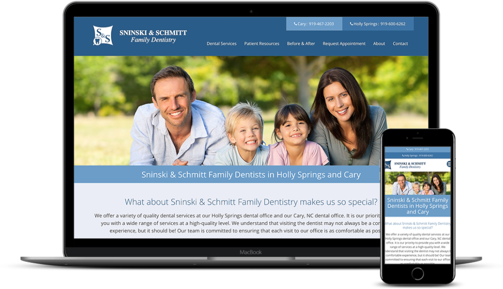
Notice how Sninski & Schmitt Family Dentistry notes their locations immediately: Holly Springs and Cary. This makes it easy for a vistor to see right off the bat whether or not this is a denal office they should explore further.
This is far more effective than having a page that is just labeled “Dentist“. Without clear, effective copy at the top, users won’t know if you offer what they need. These users won’t scroll down or stay long, again losing you business.
Having this information immediately visible takes the guesswork out of it for your customers. This way they’ll know they’ve found the right website.
3. Your Contact Forms are Too Long
Let’s say your site is doing pretty well. The site has been optimized well and is ranked at the top of Google searches for your relevant keywords. Your content has enticed qualified traffic to your site. Your calls-to-action have worked and now your potential customer is near converting.
Unfortunately, your super long, complicated contact form has annoyed and daunted the potential customer. So now they’ve navigated away before contacting you.
It’s easy to get caught up in creating long contact forms so that your sales team can capture every piece of relevant information about your potential lead. However, simple forms are far more efficient in converting leads.
Here are typical problems on submission forms.
- “Required fields” that your customer missed caused the entire form to reboot. Now they have to fill in all their information again.
- You asked for too much personal information and spooked them.
- You overloaded them with detailed questions.
Let’s say you’re a dentist, and you want an idea of what kind of work your potential client will need to have done. By forcing your customer to explain in-depth about the issues that they’re having you might unintentionally frustrate them. In fact, by asking them to explain all their needs to you up-front, you’re actually putting a workload on them that your employees could do instead. Lighten your customer’s load and only ask for the bare minimum of information:
- Name
- Email address
- Phone number
Now, your staff members can call them back to find out their availability and what kind of dental services they need. Once you’ve streamlined your submission form, it will be more likely that your leads will start converting.
4. You Aren’t Promoting Your Hooks
Are you offering a special holiday deal? Do you have free shipping? Have you implemented a promotional code to save money? If you have an irresistible hook, be sure to dangle it in big, bold letters and put it right where your website visitors will see it.
A good place to position your hook is right alongside the click-to-call phone number. This combination works together to increase the potential of converting. It’s also a good idea to have a smaller hook at the bottom of the page as well.
Having a unique selling “hook” can help set your business apart from the competition and provide that extra nudge at the conversion point for your visitors to contact you.
A hook refers to that little extra something that your business and your website offer that tips the scale when a prospect is considering your business.
Small Website Hooks
- Rated #1
- Largest Selection
- Guaranteed
They may seem small, but customers are often swayed by terms like “Award-Winning” or “Rated #1”. Just make sure whatever hook you use is true about your company.
Large Website Hooks
- Use this promo code to get 25% off.
- Get Your First 30 days free!
- Buy now and delivered by Christmas.
If you have a free offer, you should promote it wherever you can. Don’t overpromote it, but don’t hide it either.
Slow Acting Hooks – Businesses with a Longer Sales Cycle
Many businesses have a longer sales cycle. Their typical customer wouldn’t simply log into their website and make a purchase that same day. For example, if you’re offering IT services, medical care, or marketing consulting your clients will enter a research phase before they purchase. You’ll need a different type of hook to capture these customers, such as:
- Download our five-page definitive guide on Cloud Hosting.
- Sign up for our newsletter to receive coupons and deals.
- Join our mailing list for great tips.
To download the guide or subscribe to your newsletter, the customer has to simply enter in their first name and email address. This then allows you to add them to your email list and continue a conversation with them.
However, this type of hook won’t work for all users. To someone that is trying to learn more about this technology, this is a great offer and has a high likelihood of getting them to take action. If the customer is looking at another product such as buying a domain, they may not be interested in this.
Throughout your website, you should be questioning whether you have asked the customer to buy, to contact you, or to get more information. You must balance this with thinking about what the benefit the users gets from doing that action.
ADD TO CART is not a hook
If you have an ecommerce site, “Add to Cart” is a function of your site, not a hook to engage the user. A proper hook in relation to buying items is:
- Get free shipping by adding $14.97 more to your cart.
- Enter promo code DISCOUNT to get 20% off.
- Guaranteed to arrive before Christmas!
Get More Conversions and Website Leads
Contact the award-winning web design and digital marketing team at TheeDigital to help get your site looking beautiful and optimized. We specialize in creating stunning websites that rank well and convert. Call our team today at 919-341-8901 or schedule your free, no-obligation consultation.
Need digital marketing or web design services for your business website?
Learn how TheeDigital can help with your Web Design and Digital Marketing needs.
Tags: Digital Marketing • Search Engine Optimization • Web Design
Richard Horvath
Richard Horvath is the founder of TheeDigital, a Raleigh based award-winning web design and digital marketing agency. He is proud of his team and the results that they provide to their clients.