The ACC Logo
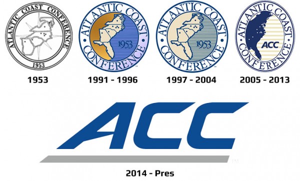
In 1953 The Atlantic Coast Conference was born and with it, a logo. The 1953 ACC logo reigned for more than 60 years with only minor modifications. The original ACC logo was iconic for a long time, but it was retired in March of 2014 and a brand new, modern logo took its place. There are many reasons why organizations should update or completely change their logo. So why did the ACC suddenly, after more than 60 years, decide to go with a different logo design?
Timing and Significant Organizational Changes
The ACC conference started with 8 schools from 4 states. The conference looks very different today. The recent conference realignment added schools like Syracuse, Louisville, Notre Dame, and Pittsburg. The ACC also lost Maryland, a long time ACC member, to the Big Ten Conference. The current ACC conference is now home to 15 schools from 10 different states. 2014 was the perfect time to make a significant change to the logo to mark a new chapter in the ACC’s history. You should consider updating or modifying your logo to reflect significant changes your company has gone through or is going through now. Maybe you recently acquired a new business or experienced a merger. Maybe you started selling a new product or offering a new service that has become a significant part of your company’s identity and/or future. By updating your logo to represent recent changes to your organization you can get in contact with new clients and customers. You can also show the world that you are a growing company that adapts to change.Outdated Look
The original ACC logo incorporated a simple, yet effective design that served the ACC for over 60 years. You can see that from 1953 – 2014 only small modifications were made to it. The design was that good and held so much value and brand recognition that the ACC didn’t need to change it. But compared to other athletic conference logos, it did look outdated. Its 2014 replacement is sleek, modern, and much more versatile. A contemporary, professionally designed logo will convey to people that you are a modern-day company. If you can’t tell if your logo is outdated, just ask a professional. They will be able to tell you in a matter of seconds whether your logo is outdated or not. The vintage look does hold value, but incorporating even small, modern design techniques can be very effective in gaining customers and improving your overall brand and identity.Too Complicated
The ACC’s old logo was a little complicated and arguably difficult to digest when compared to modern logos. If you look at the old logo and look away very quickly you probably won’t be able to identify it exactly from memory. If you look at the new, simplified 2014 logo and look away very quickly, you’ll be able to instantly recall its design elements without question. In many cases, a logo redesign is a reduction in design elements to make the logo appear simpler and easier to digest and remember. Think about Google, IBM, and Yahoo. These companies are deep-rooted, modern organizations that incorporate their company name as a central design element. This isn’t a coincidence. This design concept is effective because it is easy for people to remember and analyze at a glance or a scan.Does your logo pass the Eye Test? Let Thee Professionals at TheeDigital take a look. Contact the Logo Experts at TheeDigital in Raleigh, NC at 919-341-8901 or schedule a free consultation.
Tags: Community


